JAY: TWO WAYS.
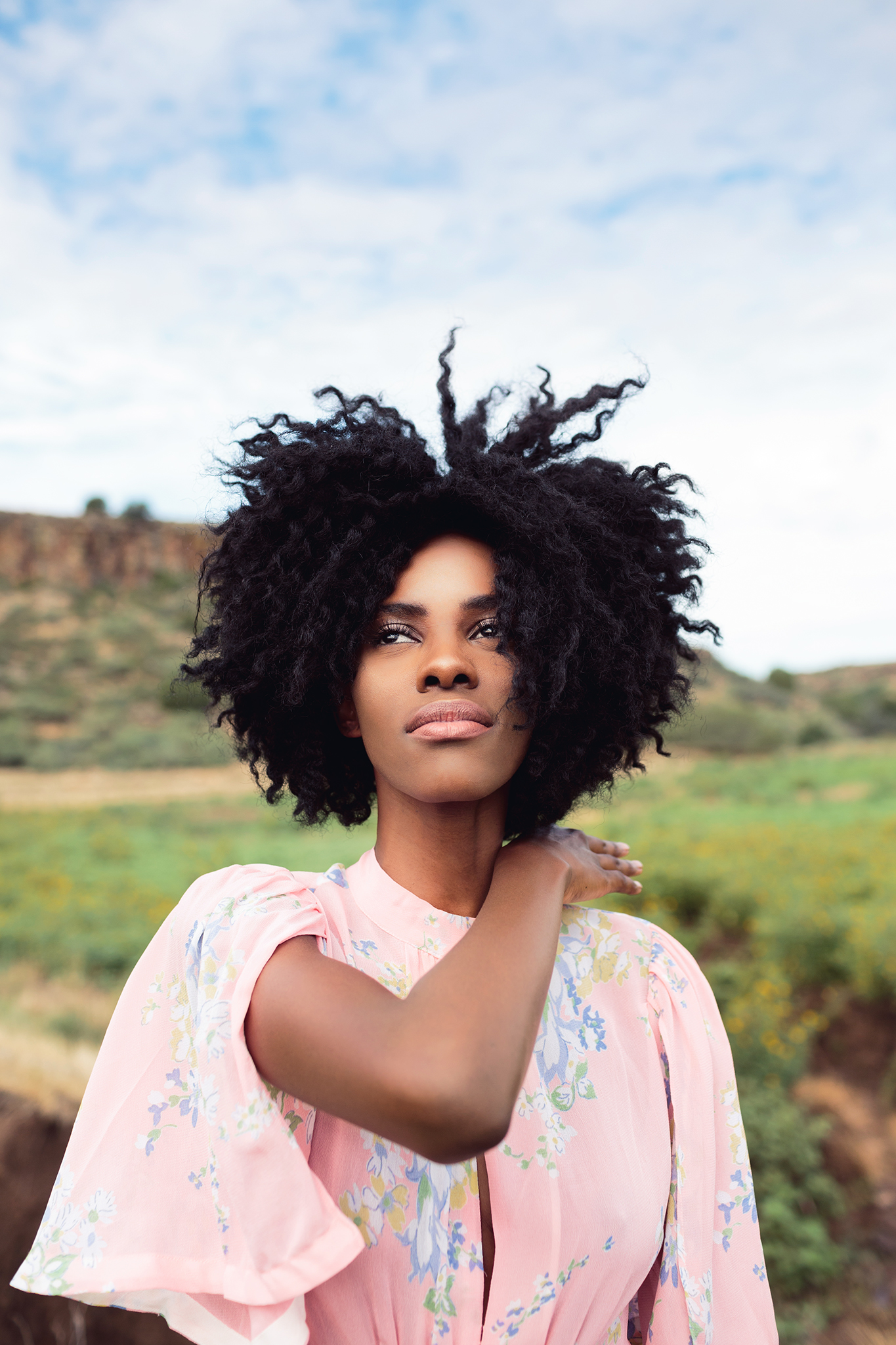
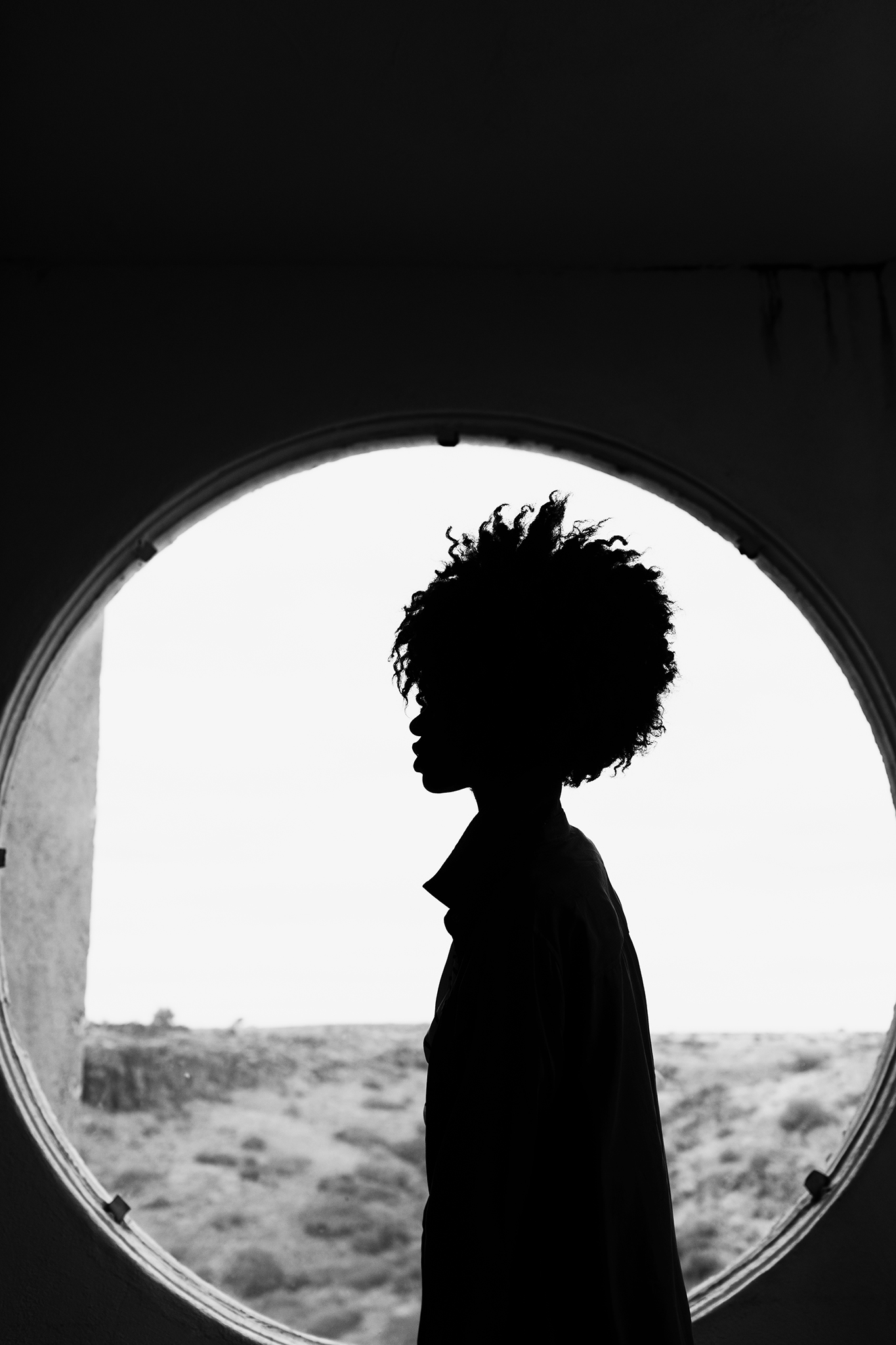
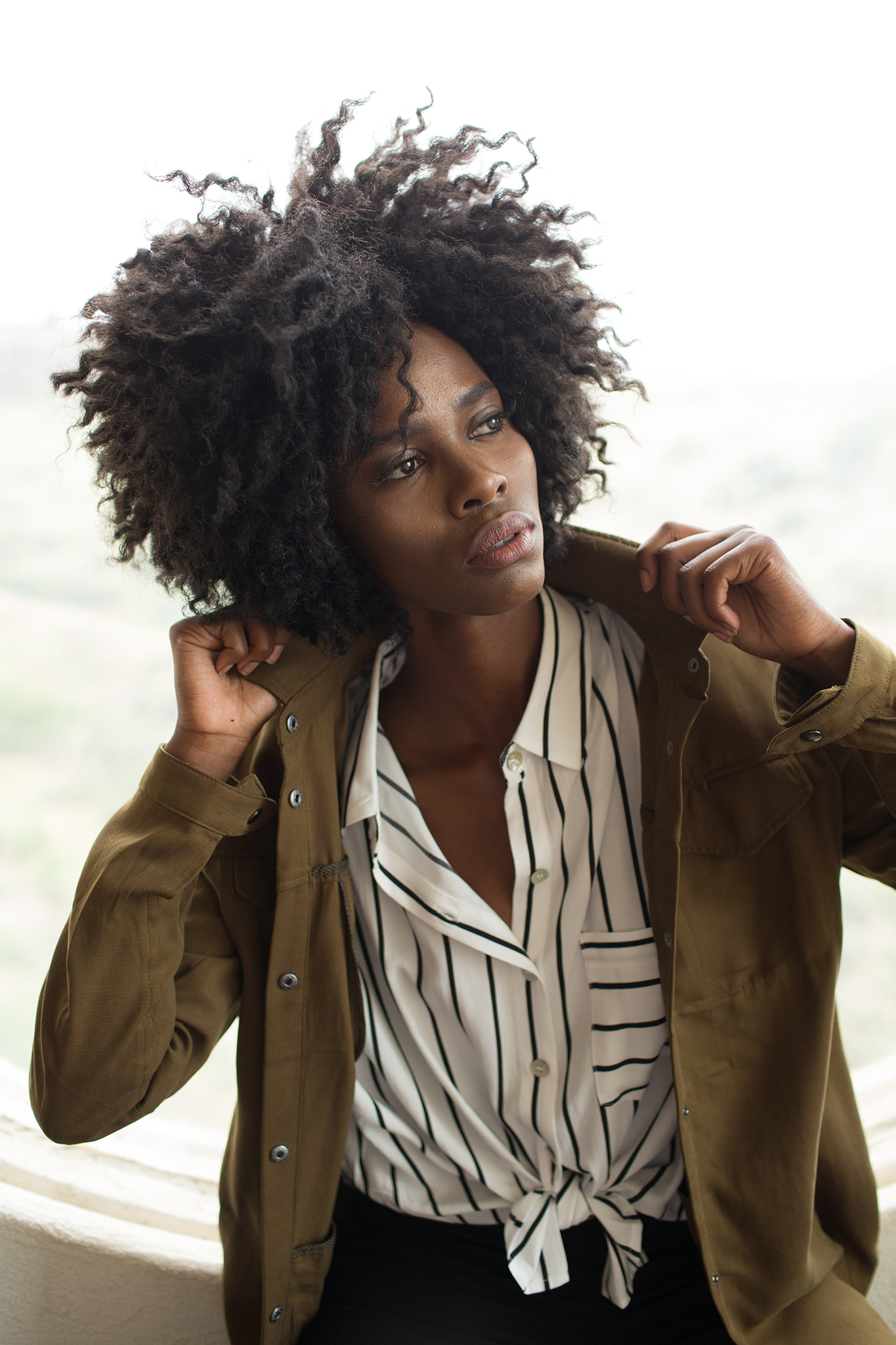
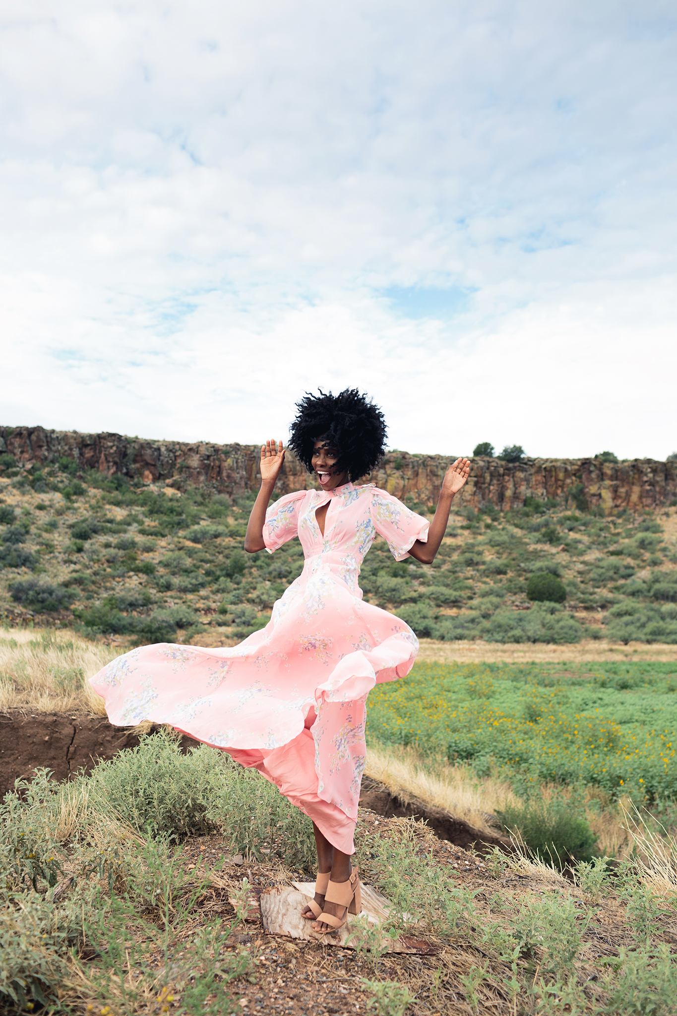
One model, two ways. I didn't create this project with you in mind (sorry if that sounds rude)-- but when I initially set out to do this project, it was more-so to prove to myself. Prove to myself what? Who even knows anymore... but honestly, that I wasn't some one-trick pony. If you've scrolled through my Instagram or had an actual conversation with me, you'd know that self-confidence does not just ooze from my insides. I struggle a ton with comparisons and figuring out who I am. My photography style is bright and colorful in an industry that is currently geared towards dark and moodier images with film-like edits. No one believes in blue skies right now... and I eat them up. And I would be lying to you if I said it didn't have an effect on me. Sometimes I sit at my computer and I beat myself up over the fact that I don't feel my work is versatile enough, or it doesn't fit the mold, or the dreaded, "Is my work commercial?" The amount of times that question has popped into my head is insane. Don't get me wrong, commercial photographers make BANK and live a way cooler lifestyle than myself... but I want to be recognized as an artist, I want to be a creator, an innovator.... I just want to make shit that makes other people feel something or think something -- good, bad or otherwise. The entire premise of this shoot was not just about taking a model and having her look like two completely different people.. it was also about me. How much could I push my creative abilities as a photographer to showcase both sides of my brain? Do I have it in me to be versatile? Do I have more to offer this world than just the same thing over and over?
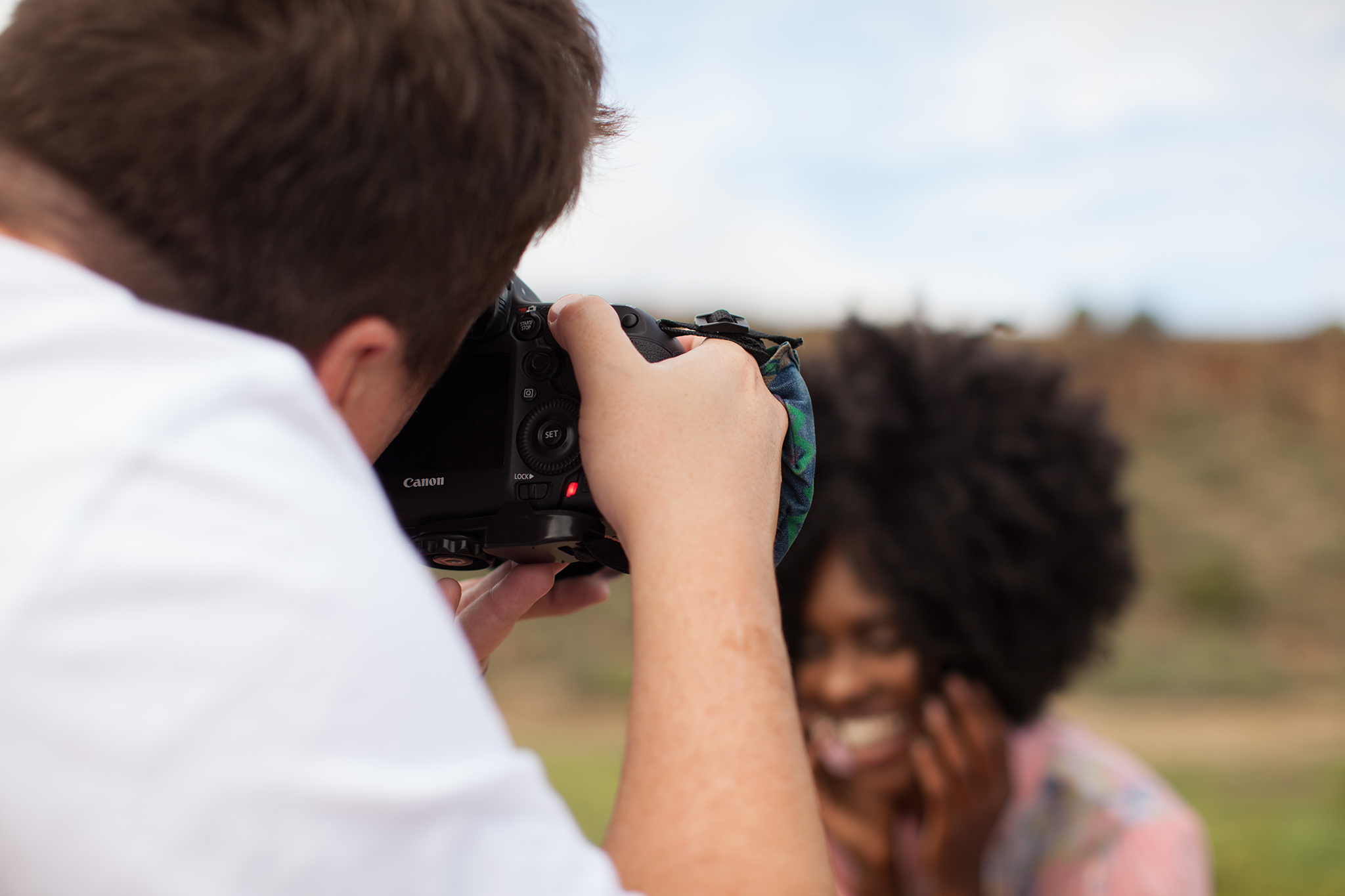
For anyone wondering, this entire shoot was shot on my Canon 5D Mark III with my Canon 35mm 1.4. That was it.
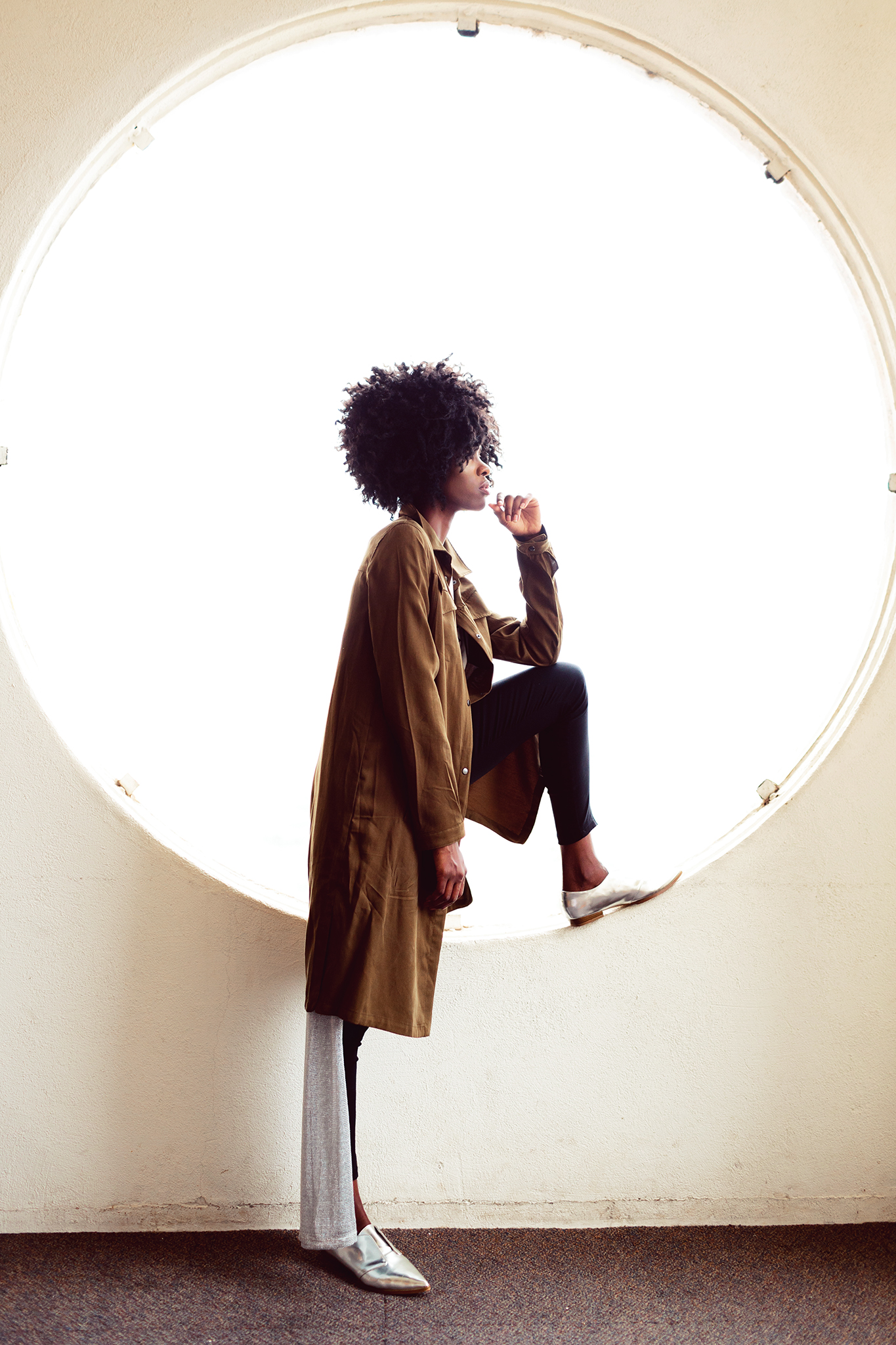
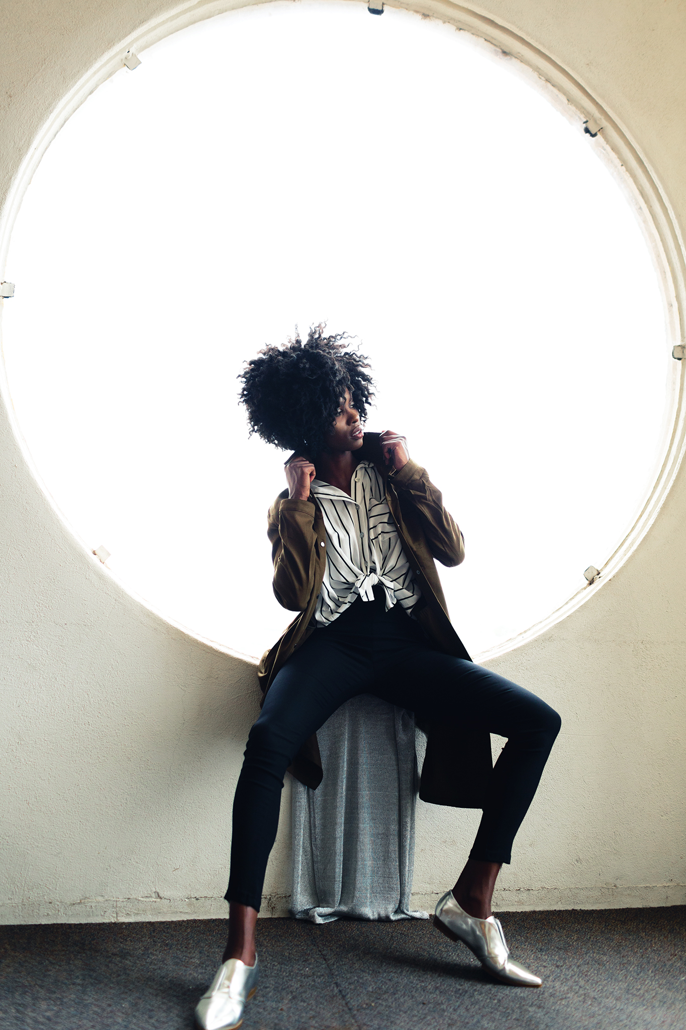
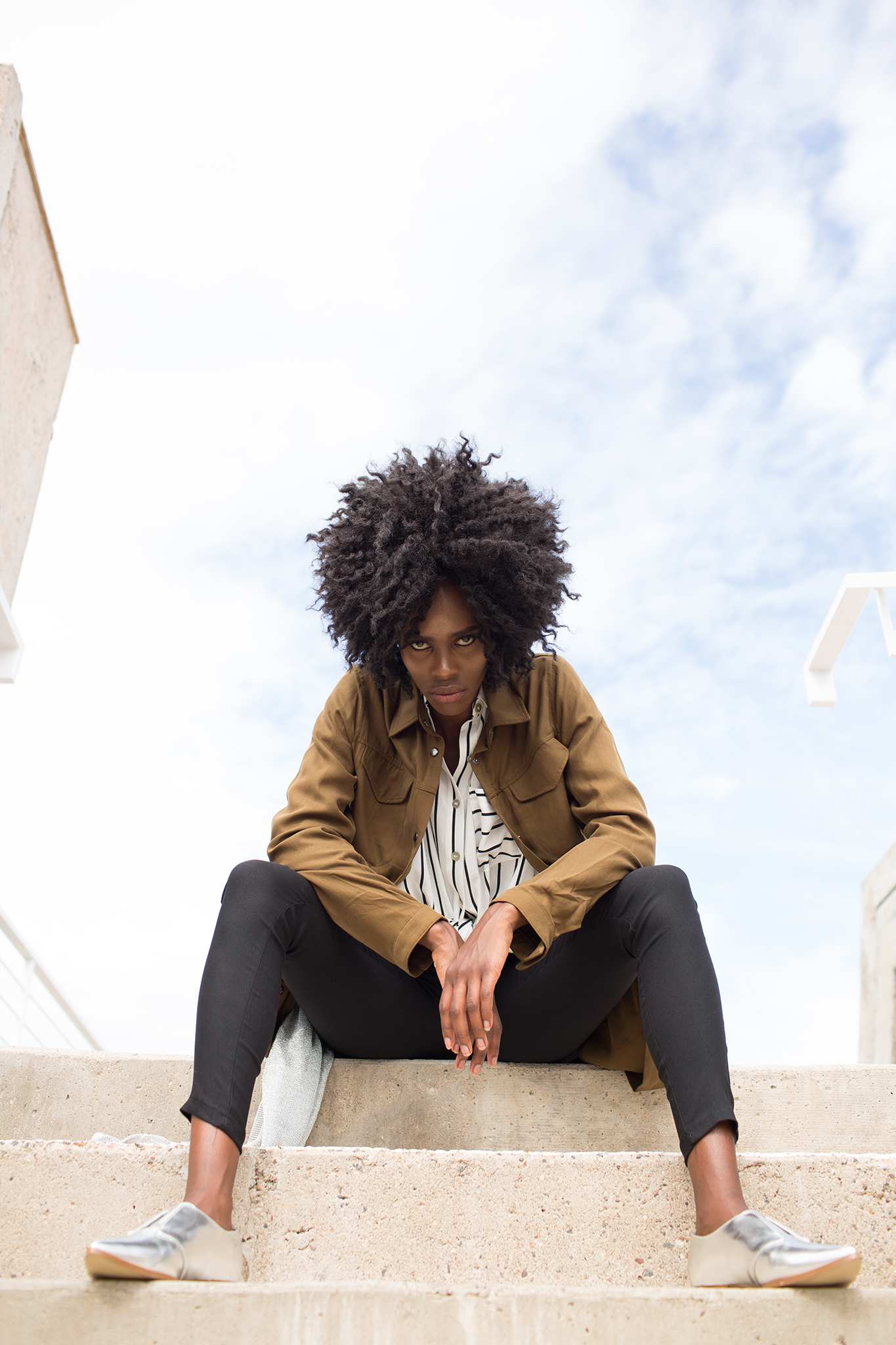
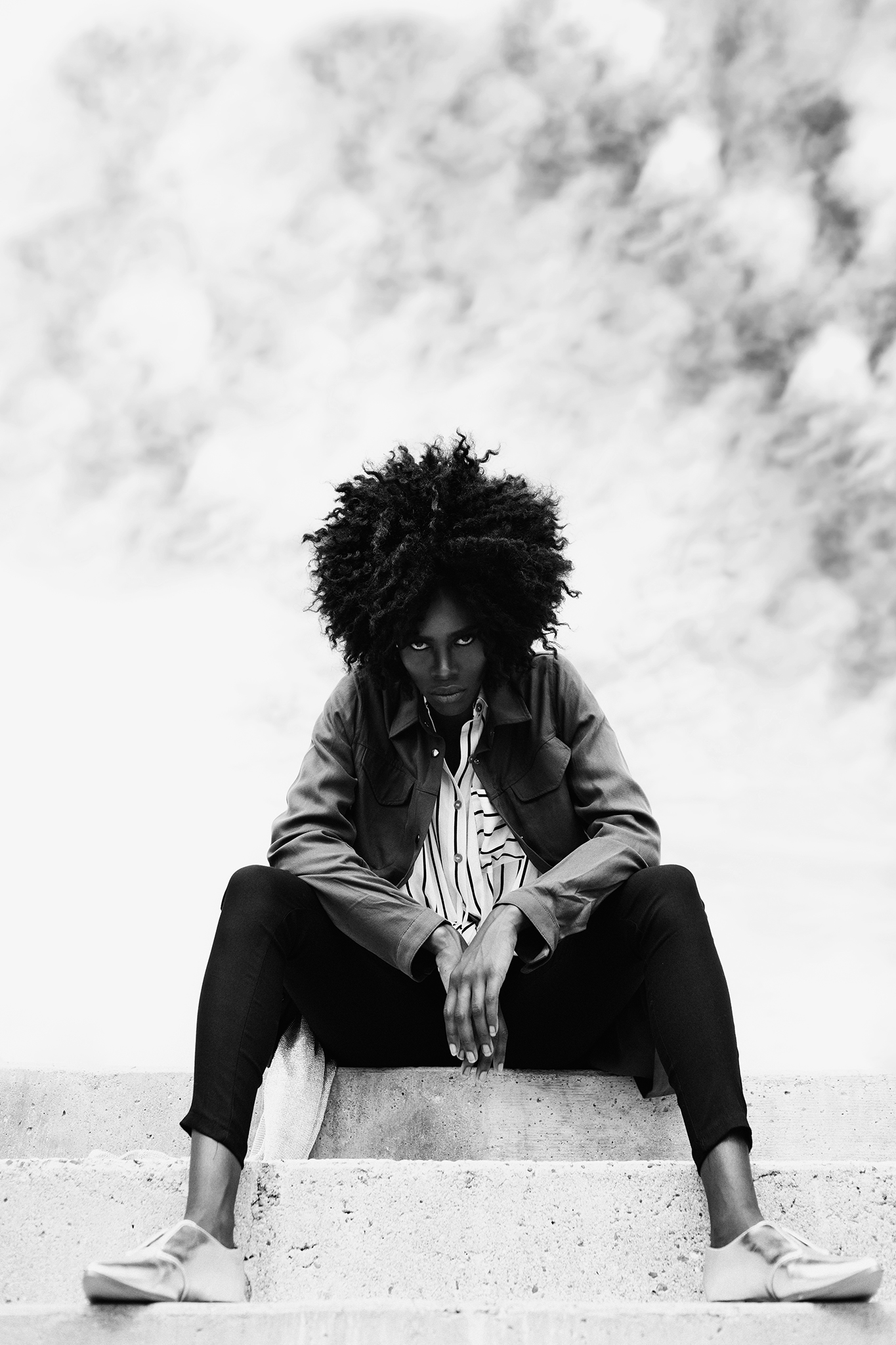
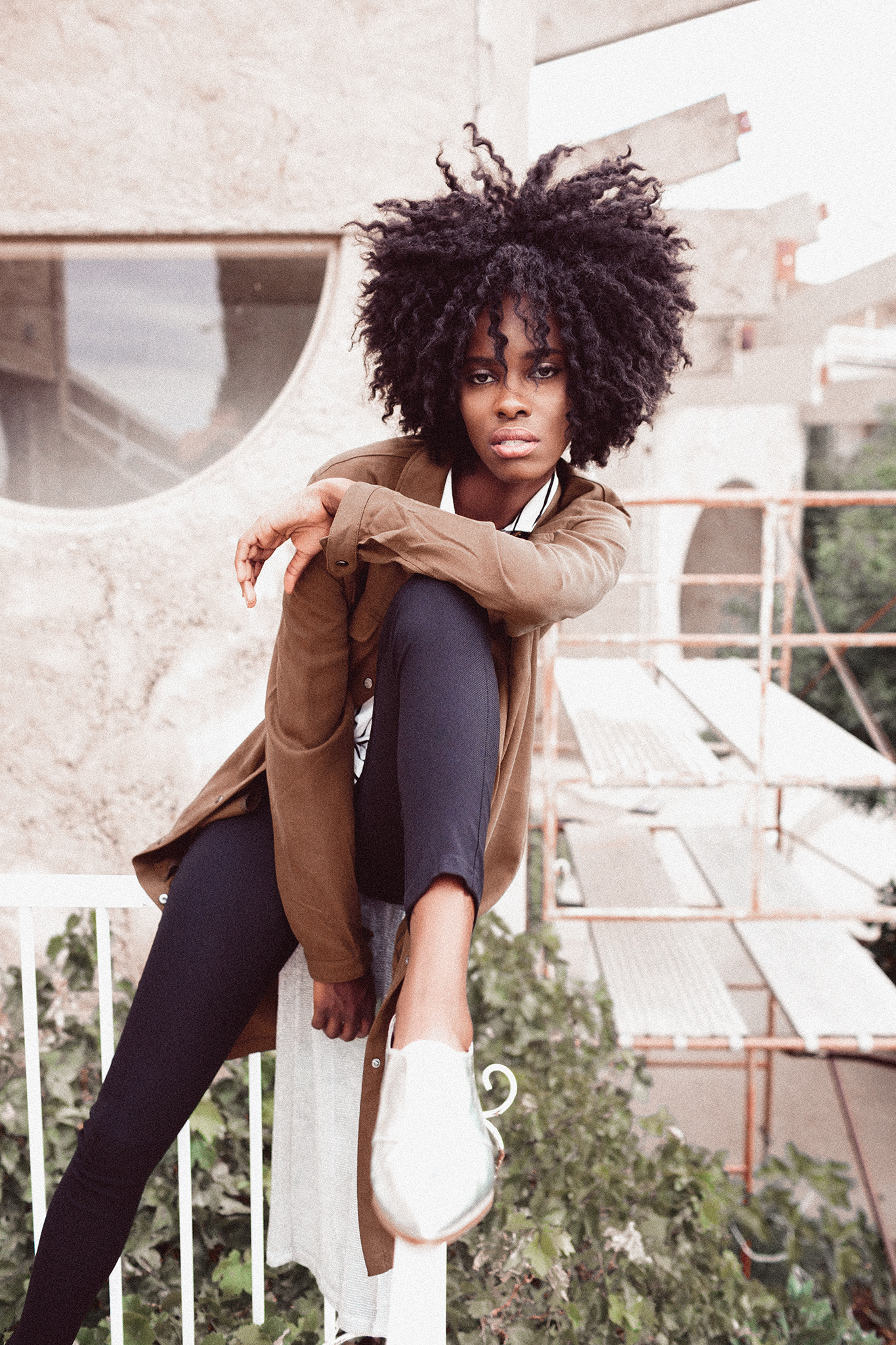
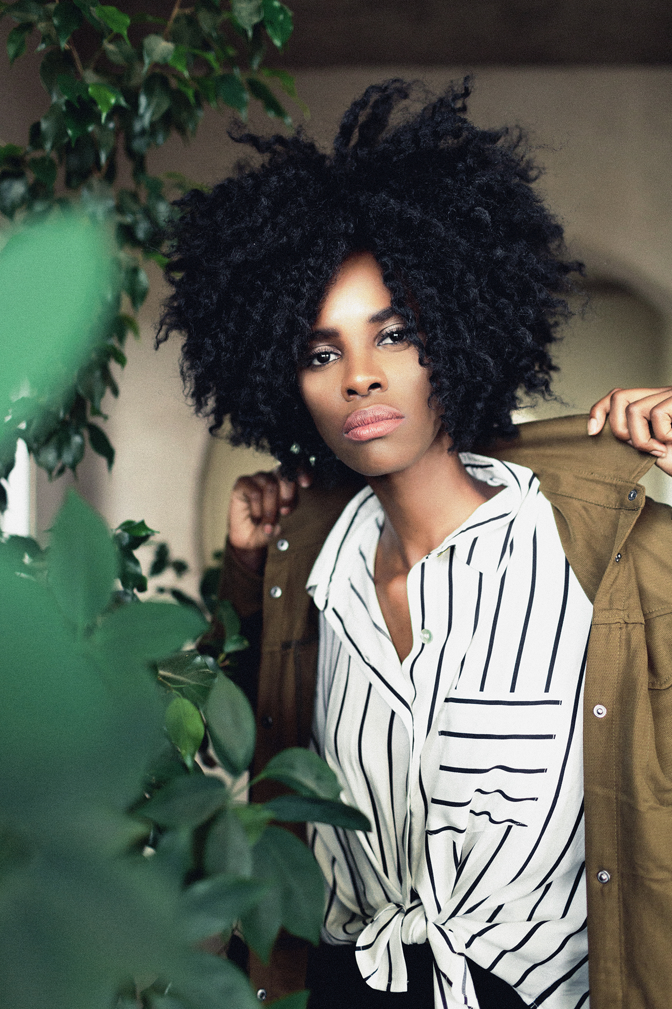
I style these shoots from head-to-toe... from the hair and make-up, to the location decisions, to the clothing and shoes... everything you see has my touch. I am a control freak, obviously. I hear others photographers talk about how hard it is for them to find good outfits for their own styled shoots... so I want to give you a little insight on this entire look. First, the pants. They can be found HERE so you can see them in all their glory. They are ugly. I am sorry if you own them-- but the laces up the side are definitely not what I was going for. BUT, because I knew the shirt and jacket would both be baggy, I knew the laces wouldn't show. The jacket and shirt were both good-- nothing exciting to tell there. BUT the shoes... those were $4 on clearance (returning shoes is next to impossible-- we've even put packing tape on the bottoms to keep them clean and they still get dirty. So when I find shoes on clearance in my models size... it feels a lot like a sign from above. But then, the really fun part and the piece that you may not always notice, but what I felt really felt finished off the outfit. Her cape. It's actually a dress. See it HERE. Had she actually worn that dress... her biscuits and potatoes would have been on complete display for the world to see. But I wanted the metallic touches. So instead, we just safety-pinned the dress onto the shoulders of the shirt (the jacket covered that whole mess) and it became a cape. I am a sucker for layers and I will create them however I can. So stop trying to find some amazing outfit that you can just swing in and grab... use your creativity and make cha-cha pants and see-thru dresses work for you.
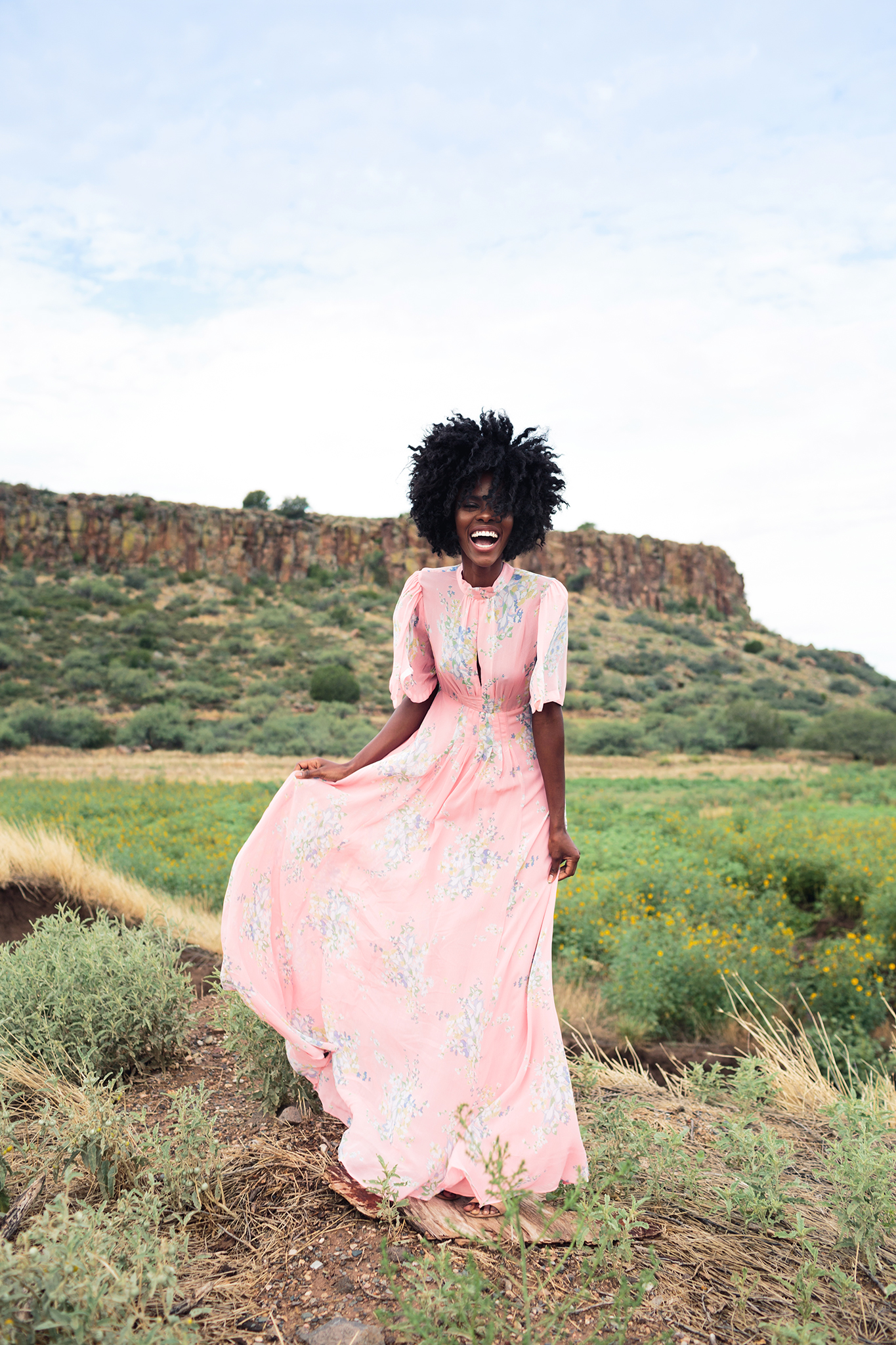
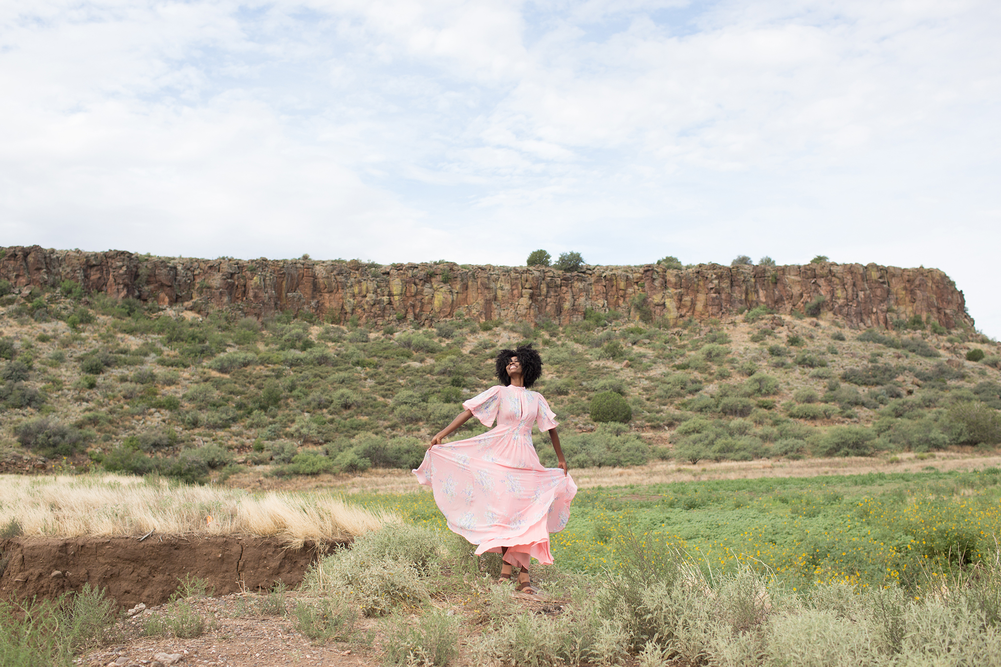
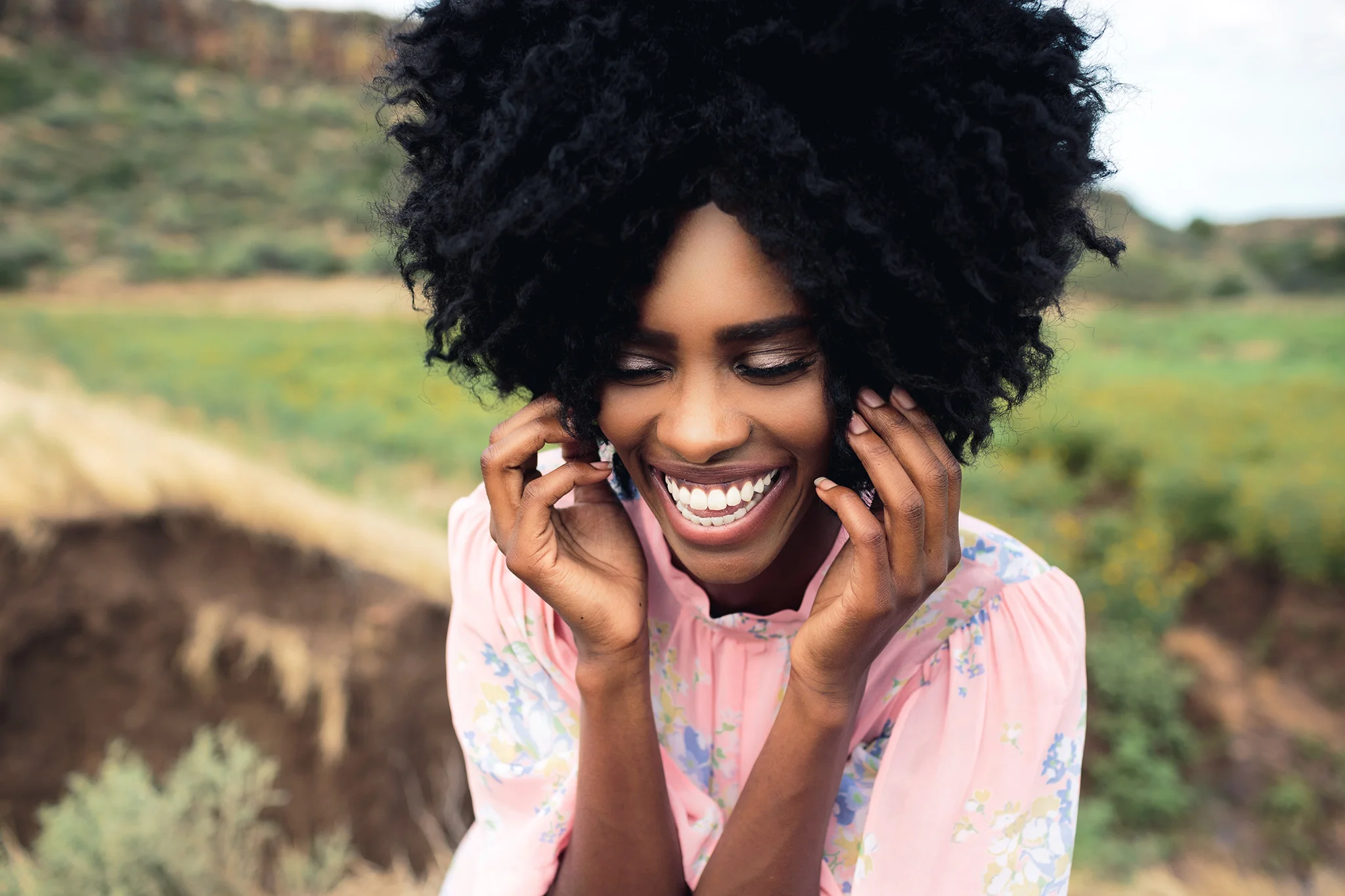
I'd love to add some witty content about the styling of this dress, but the truth is, I saw it on Free People a few months ago and knew I had to photograph Jay in it. It is gorgeous and expensive and I didn't use a lick of creativity to make it work.
Let's talk editing. Because even though my location changed, the lighting changed, the clothes changed, the posing and stories changed, had my post-processing not changed, the photos would still be very similar. My inspiration while editing these photos was winter. That sounds really weird, but its true. I wanted these photos to make you feel it was 40 out and not 115. I used grain to add some grit (not sure if thats the correct word, but it works for me) and to add details to those shadows without losing them. If that makes any sense. I wanted my backdrop to be blown out by a very soft white as to not distract from her. I didn't want any sort of markers or things that could tell you WHERE this photo was. It could have been anywhere.
WARNING: GRAIN AHEAD. But for real... this isn't grain from shooting with a high ISO, its grain that I strategically put there simply because I wanted to. And I think this a good time to point out that "moody" doesn't have to mean dark... I actually brightened up the white wall in this photo because I wanted to give it a it a stark white feeling-- adding to that feeling of cold weather I mentioned earlier. If you look out the back window and think it looks more like its raining than scorching... then I did my job.
In the next BEFORE + AFTER... do me a favor and peep that foreground. That dirt was taking away from the scene I was trying to create. That dirt was saying, "Welcome to Arizona... where we sweat our balls off on the daily." And instead I wanted it to say, "Welcome to the land of green and beauty." So, clone tool the shit out of that. Fun fact: earlier in this post you saw a picture somewhat similar to this one... did you notice I just simply copied, pasted and flipped the right side of the photo onto the left? Just the ground, not the mountain. Here I wanted to keep the little hill behind her so I just cloned some bushes to cover the dirt. It took me all of an extra 2 minutes and made the world of difference. So that's the foreground... but lets talk about something in the background that REALLY makes this photo stand out... that sky. Here is my rule of thumb with skies... if you can expose for it and save those details even just a tiny bit, you can make it dramatic. BUT if you have a completely blown out sky, you can't just add one back in. It will look more fake than Kim Kardashians butt. Because I shoot in raw and because I was able to save just enough blue sky and clouds in camera-- I could do ANYTHING I wanted with that sky. Here I just wanted it really bring it to life, nothing too crazy. And I am obsessed. The gradient tool will become your best friend.
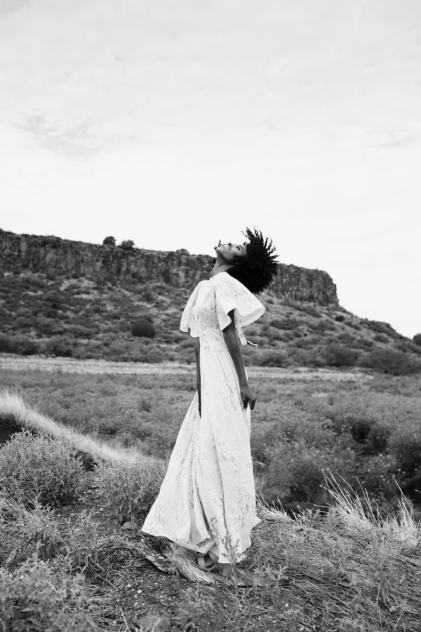
It wasn't until I started reading Ben Sasso's blog that I started to pay attention to the smaller details of my photos. In his post he talks about how certain things, like a small rock or a hole in the ground can create distractions, these seemingly insignificant pieces of your photo can play a much larger role than you think... but its usually not until you take them out that you notice just how distracting they were. For this next photo, I really felt the the stair-rail and the part of the building were taking away from the drama of the sky. So I cloned them out in Lightroom and pulling from the portion of the sky that was white-- because I want it to be clean. Then I went over those clones with the clone tool again and this time pulling from the parts of the sky that were blue. I wanted this photo to be dramatic and an awkward 1/3 blue sky was not doing that for me.
and then I threw it in black + white and was so turned on (artistically, of course)!
Okay you guys. I am sorry for how long this post turned into. I am SO happy with how everything turned out and I feel like I did what I set out to do. I hope you guys liked it. Or learned something. Or felt something. I am so excited to start blogging again. So if you guys have any questions, send them my way. Because there is only so much content I can come up with on my own. For real... I love you guys.
-Your buddy, Ace.


